With men wearing fewer ties with their jackets these days, shirts carry more of the burden in creating style and interest.
Of course, there is another way to look at it, which is that we have more freedom. Suddenly those bold patterns that were too strong for almost any tie are easier to wear.
Probably the safest way to do this is with stripes. Checks are hard to get right, and prints harder still. But you can easily dial up the size and strength of striped shirts, until you find a range that works for you.
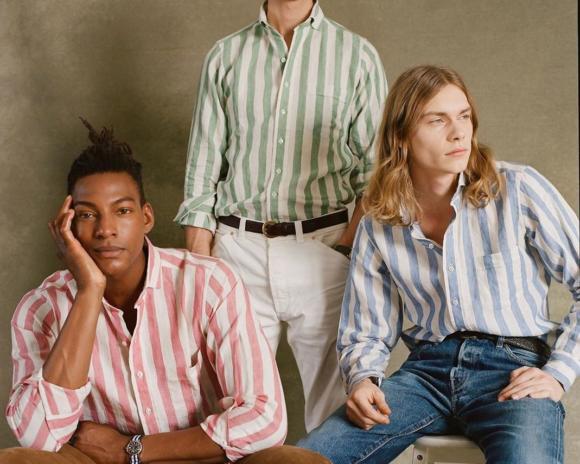
The guidance as to which stripes are more or less formal shouldn’t surprise anyone by now. The thinner, more muted, and more conservative the colour of the stripe, the more formal it is. Pale-blue bengal stripes are great for both work and leisure. Grass-green awning stripes (below) are really only for the latter.
One thing I’ve found in talking about shirt patterns in recent months, is that not everyone knows what the names of the different stripes are – or indeed agrees on their nomenclature. There are different associations in different countries, and sometimes inconsistent use across the industry.
As part of the recent guides we’ve been doing on shirts, therefore (so far including collars and cuffs), this article will define and illustrate the shirt stripes, and hopefully provide a useful reference as a result- similar to the one on shirt weaves and designs we wrote last year.
We’ll start with the most popular stripe patterns. The ones you’re actually likely to use when asking your shirtmaker to show you something; or maybe to describe to a friend on the phone what you/they are/should be wearing.
And we’ll generally run from thin to thick stripes, which as noted, generally means from smart to casual.
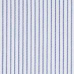
Hairline stripe
A design with a very thin stripe, running close together, meant to be similar to a hair’s width. Usually alternating between white and a colour, but sometimes colour and colour. More a texture than a noticeable pattern, and best thought of in that context.

Pinstripe
Familiar from the world of tailoring, this is a design with slightly thicker lines – more a pin’s width than a hair’s – but also further apart. We will find, in general, that stripes can be divided into those where the spacing is uniform, and ones where it is not. The hairline is an example of the former, the pinstripe the latter.

Pencil stripe
A small step up in thickness: usually two or three threads in the fabric rather than one. And usually the same as a pinstripe, in that the coloured stripes and background are not even. Personally, I find this is the thinnest of stripes that can look good on its own. The others are best with a tie.
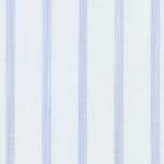
This is also the point at which we introduce variations, or perhaps sub-groups. For example a ‘music stripe’ is basically the same as a pencil stripe (same thickness, same spacing) but is found in two colours more often. It is so named because it resembles the staves of music notation.
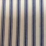
And a ticking stripe can be in many patterns, but is most usually similar to a pencil or bengal stripe. It is defined by the texture of the stripe, caused by the fabric’s weave, which resembles mattress ticking.
Bengal stripe
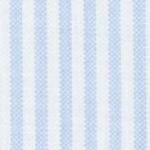
Taking another step up in thickness, we get the bengal stripe. This is defined by its width, by its even spacing, and by being always alternating colour and white. However, the first point – the width of the stripes – does sometimes vary while maintaining the other two aspects. Thinner versions can be called fine bengals, and thicker ones double bengals.
Another sub-category is the ladder stripe, which is a bengal stripe in end-on-end fabric.
Like many things in menswear, the origin of the name is British, but stolen from elsewhere. It was a pattern worn by the Bengal Lancers, a division of the British Indian Army, and inspired by stripes used on local cloths. It is probably the most versatile of all shirt stripes – in a pale blue or pink it can be worn with most ties, but also has enough interest to stand on its own.
Candy stripe
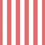
One more step up in size takes us to the candy stripe, which references the bold stripes you might find going through sweets such as a rock. The spacing here is still usually even, but the stripes are larger, and the colours often bolder and brighter. It is one stripe with quite a lot of inconsistency in use though, and the stripes are not always evenly spaced, or indeed bold in colour.
Most of the time, though, this is the start of casual-shirt territory: not necessarily to be worn with shorts, but unlikely to sit well with a navy suit.
Awning stripe
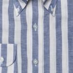
The largest stripe, and one that has become popular in recent years – probably specifically because of the lack of neckwear for it to compete with. The name references awnings used over shops, and it is the biggest stripe usually found on shirtings.
Butcher’s stripe
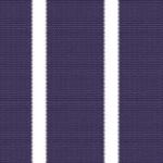
Now we return to stripes with uneven spacing, just at a larger scale. The big name here is the butcher’s stripe, which is defined by its coloured element being larger than its white. The name comes from the traditional pattern used on butchers’ aprons, and that coloured element is often strong and bold.
It doesn’t have to be, though, and in paler variations the butcher’s stripe can be attractive and versatile. The coloured element makes it more similar to a coloured shirt, such as pale blue, often making it easier to wear on its own. A variation is the reverse stripe, which is a general term for any stripe where the coloured element is larger than the white; the actual size of that coloured stripe can vary considerably.
A second group of stripes is less likely to be used by consumers, and perhaps more by those in the industry, who are more in need of categorisation.
They also tend to be more complicated or idiosyncratic patterns, and for that reason I would advise readers to treat them with caution. Such stripes risk being showy, gimmicky, or simply looking old-fashioned very quickly.
Any stripe mixing various different widths and spacing. Usually one or two colours.
A main stripe that is surrounded by one or more other, thinner stripes, creating the effect of a shadow.
Thick and thin stripes, with the thinner surrounded by a paler colour, or white, resembling a halo.
A particular design with varying widths of stripe, in multiple colours.
A stripe where the pattern is created by the structure of the weave, for example a herringbone. Satin stripes are created by the same variation in the weave.
A name for a horizontal stripe in the fabric, though this is little more than a descriptive term, really.
Any stripe that resembles a striped English regimental tie.
There are more names than this, but they either become very niche, or purely descriptions – such as ‘irregular’ stripe or ‘double’ stripe. We don’t need any help understanding those.
And there are more variations that don’t have names. What do you call a bengal stripe whose white stripe is very slightly thicker than the coloured? It has no name, sitting somewhere between a pencil stripe and a bengal, yet I see it all the time. Same goes for pencil stripes with very large white stripes in between.
In the end, this is just language, and language is use. We are trying to pin down a moving target, which is impossible. However, if we can just slow it down a little, that might be helpful.














Really useful article .
Always find these kind of articles on the basics very very useful
The initial line about difference between conservative and informal in terms of spacing of the stripes is a really helpful tip.
Might I suggest a followup article showing shirts in various stripes along with how to match them with trousers and jackets .
Glad to hear it Robin, and sure, a good suggestion.
This is also part of an ongoing series on shirts, so if there’s anything else you’d like to see in that series, do let me know.
And the humble chalk stripe?
Not really used much in shirt patterns, more suits
“Language is use”…..Good to see a Wittgenstein reference in an article about menswear. If you can work in some Kierkegaard I’d be even happier 🙂
Pleased someone got the reference!
Unfortunately Wittgenstein was a paper of mine at college, but never did Kierkegaard. You might get some Locke and Hume if you’re lucky.
Well, I never felt very lucky when I was studying the Empiricists, but in the context of high end menswear, I may find myself warming to them!
Whereof we cannot speak, thereof…
It seems that in America, bengal and/or candy stripes are often called “university stripe”, especially on Oxford cloth button-downs, which are historically associated with elite American universities. Bold stripes seem to come into fashion every once in a while. The current trend might be related to the fact that less people are wearing ties, but thicker stripes were also very popular all the way back in the 1910’s, as well as the 1930’s, the 1970’s and the 1980’s. Wide stripes look particularly good on summer shirts, especially linen ones.
Illuminating post as always Simon (and thus kudos), but what really stood out to me was the hint of playfulness in the title. I imagine you had a bit of fun deliberating whether or not to use it.
In the States, anyways, we also have the “university” stripe. It is a balanced stripe pattern with alternating colored and white vertical stripes 1/8″ wide. The “bengal” stripe is the wider version where the stripes are 1/4″ in width.
Cheers Tom
Simon
Perhaps a slightly niche question… But where on earth would I look for more casual tattersall check shirts? All the English / Jermyn street makers are far too formal (think cordings) and sadly the young guns (Think Drakes and AI) don’t make them. Any idea?
Good question, I haven’t seen them around for a while. Rubato does one I think, if you like their style
I know Peter Christian has some, no idea about quality/fit of them though.
Incredible guide! Thank you fro this!
I’ve really been enjoying the shirt series. To me it has been both informative and educational. Is there enough variety in sleeve shapes for an article? Are there different types of sleeve shapes(or styles ) . Matching shirts with ties would interest me.
Shirts are the biggest change in my fashion (post COVID). I’ve gone from formal stripes and tie to leisure shirts and crew necks. I can imagine never buying a mtm shirt again(or Oxfords for that matter.
Hi Simon. I fondly remember the window displays at Hilditch and Key in the 1980’s. Ticking and track striped shirts displayed with plain coloured slipovers and quietly patterned ties. I thought they were so elegant. Often the typical eighties white jermyn street collar and double cuffs added to the effect.
Yes I remember the tail end of those, and at Turnbull & Asser as well. If I remember rightly, that tradition on Jermyn Street came from English men only really wearing two ties – their club tie or regimental tie – after the War, and compensating with some more brightly patterned shirts. It may be apocryphal, but it’s a nice story.
Great piece. Have to agree, I love these back to basics “define terms” pieces. Very helpful. I’d also agree with Robin that seeing a piece about how to pair these types of shirts (perhaps seasonally) would be nice. On the shirt series, perhaps there would not be enough for a piece on this, but maybe going through different ways to make a shirt more casual via pockets, placket, tucked vs untucked while keeping things smart.
Conversely, I know you’ve done an in-depth piece on shirt fabrics (and each fabric), but perhaps re-visiting it.
Excellent article! It brings much needed clarity to what can be a bewildering subject.
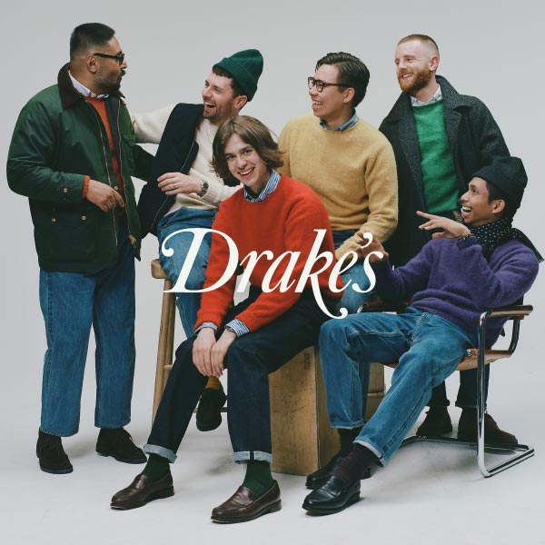
Timely and insightful article. Did I miss the reference to the maker of the awning stripe shirts that the 3 models are wearing?
No, sorry, that is Drake’s
Whilst on Jermyn Street in the ’80’s, do not forget the vivid striped shirts on display at Harvie and Hudson’s 2 stores.
Hello Simon,
What’s your view on horizontal stripes in a work attire with tie?
I think it’s a little gimmicky, and perhaps a little old-fashioned too, akin to white collar and cuffs.
Absolutely. Harvie and Hudson were renowned for pairing some of their striped shirts with ties in an identical stripe. An unmistakable look. Wonderful old style shop counters too.
Thank you Simon for naming the ladder stripe. This version makes a very elegant and subtle shirt in sky blue or light pink in 100’s. Pink in a solid doesn’t work nearly as well as the ladder stripe
Of course the white collar and cuffs still serve a purpose in barristers’ attire. The collar and cuff satisfies court standards and the coloured ‘body’ of the shirt would be hidden by the bib, bar jacket and gown!
Thanks for the article! What brand is being illustrated on the second picture down(the three gentleman with the pinstripes)?
Sincerely,
KTE
That’s Drake’s
Wow…normal clothes that I would wear.
Dear Simon,
I have a lovely shirt with a bold navy pencil/Bengal stripe, but I struggle finding a right tie. So the white is about 1cm and than the navy stripe is about half of that, so they are at the same time too close and not close enough and too wide and too narrow for most ties to work. I even find a navy grenadine fina which is a bit dry rather than silky struggles with it. What kind of tie would you advise for it? A very dark navy? A huge block stripe? Thanks for any advice!
Best,
Stephan
Hey Stephan,
Yes, strong stripes like this can be tricky, and are often better just on their own.
Your options are basically going plain, with a dark navy as you say, or perhaps a black. Or trying to overpower it with another pattern, like a block stripe.
You might find that it really works best without a tie though
S
Hello, Simon! Thanks for the reply. Indeed, it works best on its own and that is usually how I wear it. I’ve had limited success with some large patterns in bold colours (e.g. claret paisley or green mid-size medallion madder) and strong contrast block ties. I noticed my college and uni ties (the other place, sorry) works well too, one having broadly spaced contrasting sandwich gold stripes on navy background, and the other widely spaced crests.
Your opinion on darker shirts with white stripes?
I’m not sure I can imagine that looking good I’m afraid, unless it was a very 80s style